Patroula
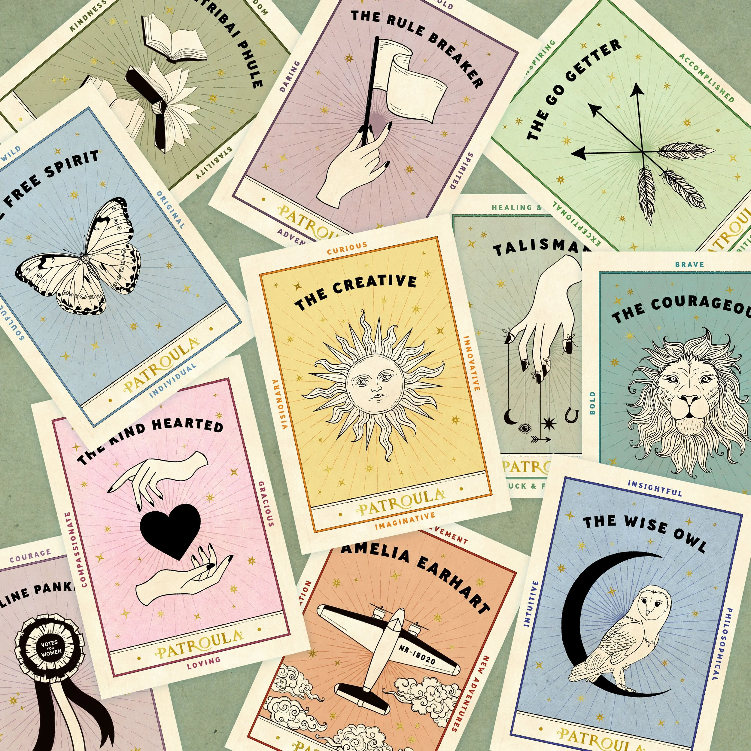
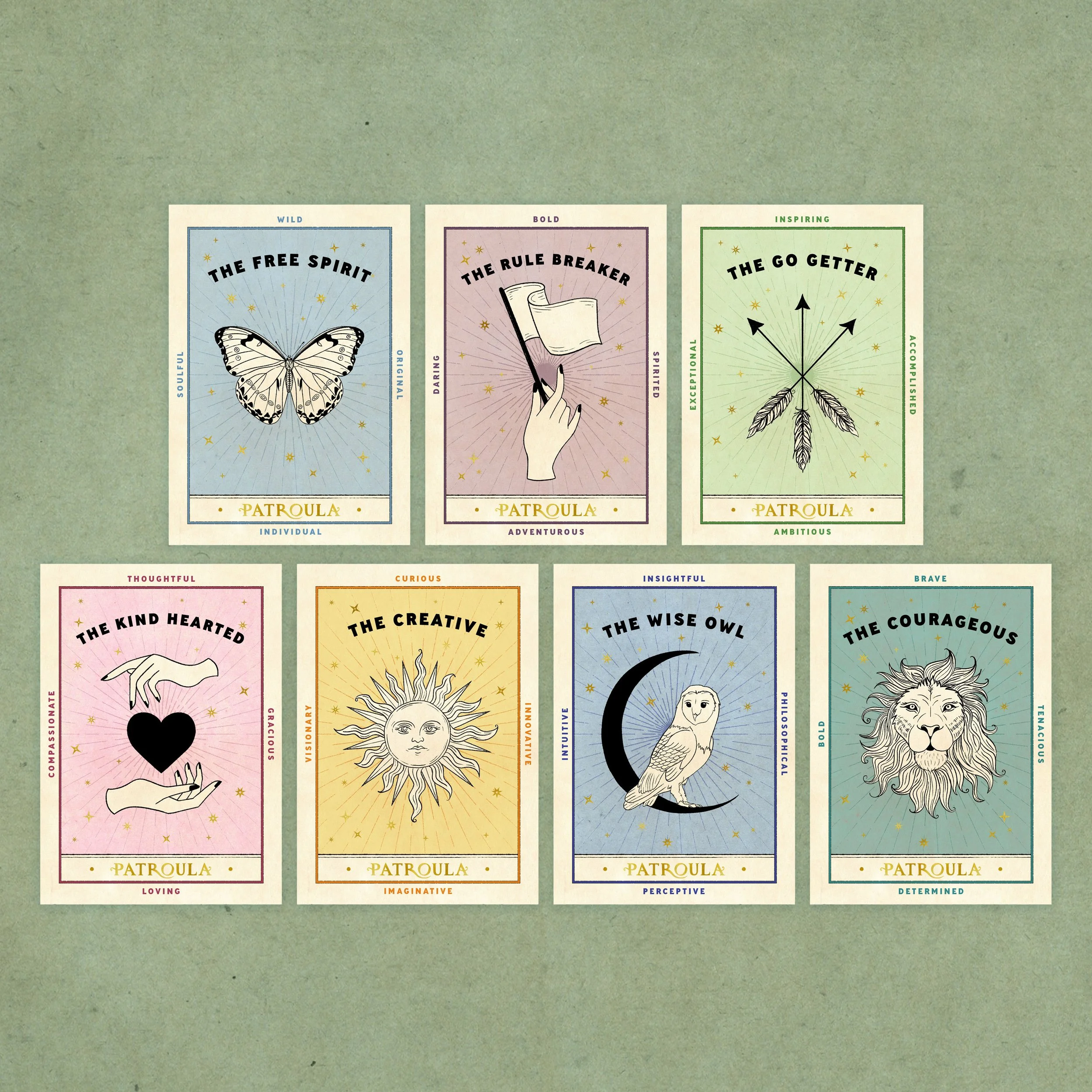
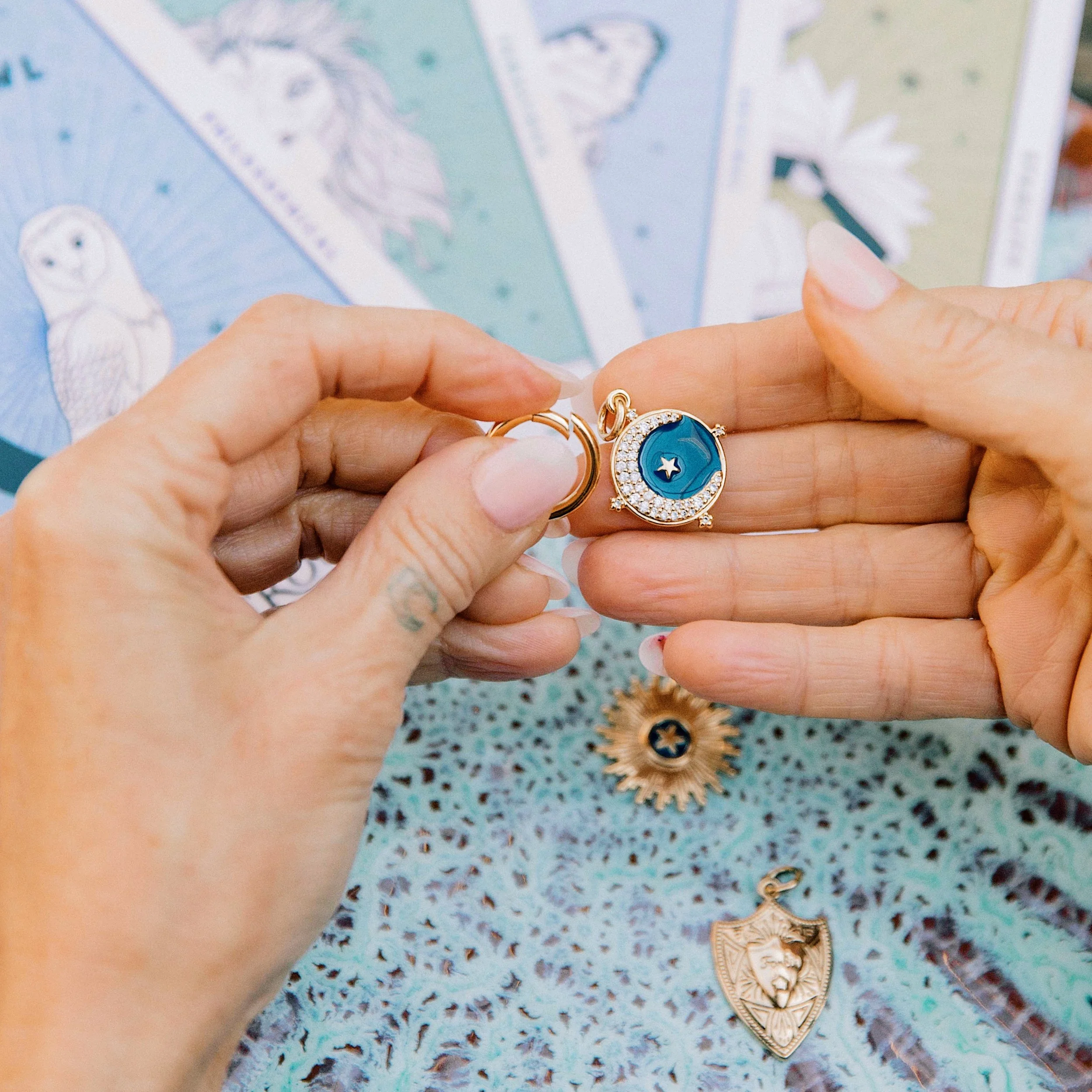
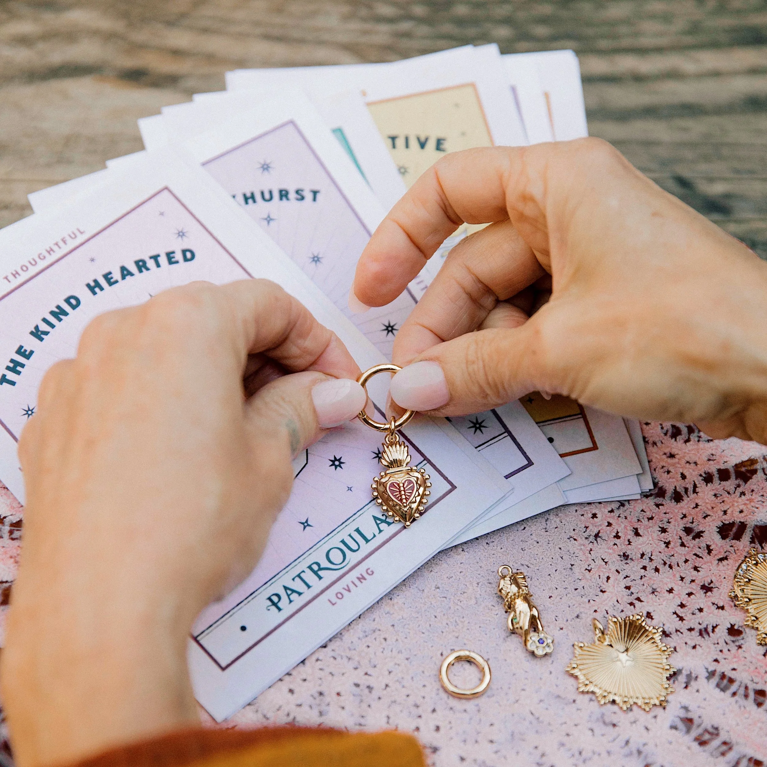
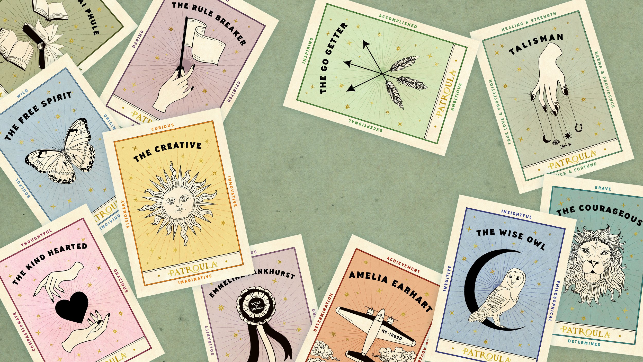
Branding and packaging design for jewellery company “Patroula”. Patroula wanted her brand identity to have a magical, almost other worldly element but for it to reflect the incredible strength of everyday women. I drew the lettering to reflect her classic style and added in some touches of magic. The R became the nurturing arms of a woman, cradling the fallen O representing love and support. Each piece of jewellery is accompanied with a card inspired my vintage tarot cards.