Yoga with Izy
Logo and branding design for my big sister Izy, and new yoga ventures Yoga with Izy.
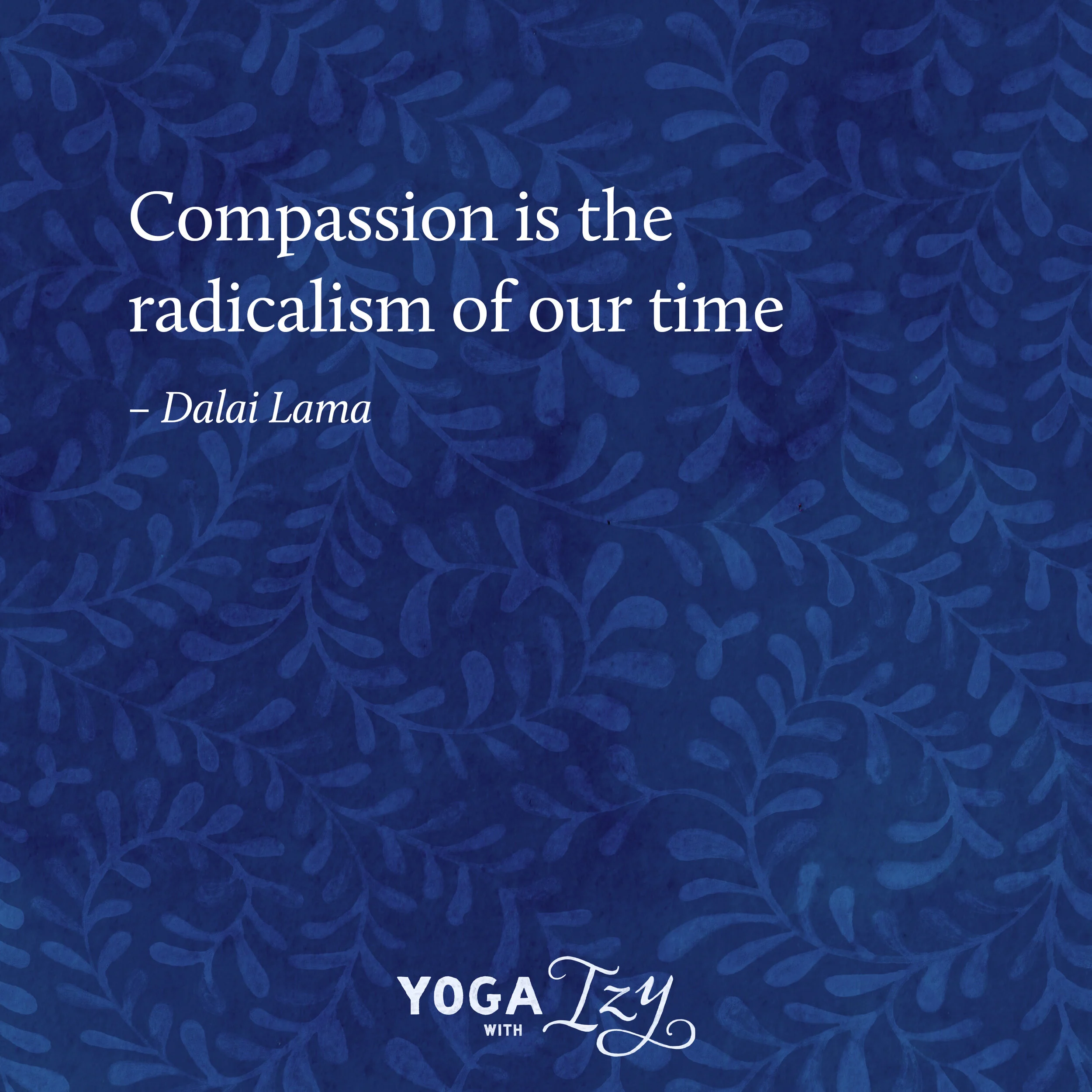
For the typography I hand painted the lettering, with imperfect lines to create character and personality and to show Izy’s own creativity. I also painted growing vines, twisting and flowing, like Izy’s gentle and mindful practice. And it had to be deep blue, to reflect her love for the ocean.
Izy’s slower classes encourage individuals to become more embodied in their practice, with the hope that you leave feeling nourished, revitalised, calm and balanced in mind, body and breath. I hope that the brand identity I have created for Izy reflects those qualities too.


